Being someone who is keen on design, desktop publishing and typography in general, I was really pleased to learn that Microsoft Word 2010 supports ligatures. That got me wondering, just how many people actually know about this? It is not so easy to find, you have to dig quite a bit and even then you may not immediately see much in the way of results. If you need to make anything that requires something a bit fancy, such as menus, invitations or certificates; or you just happen to like typography or calligraphy, it’s a really cool feature once you get it going, so here goes…
First of all, what IS a ligature in Microsoft Word? In its simplest form, it is the combining two or more letters into a continuous stroke. Why would we want to do that? Look at the following example:

Notice in example (a), the hook on the ‘f’ bumps into the dot of the ‘i’? Example (b) has a ligature inserted instead of the two separate letters to resolve this issue. These problems with certain letters, or characters, tend to occur or at least become more noticeable when the font size is increased or when text is italicised.
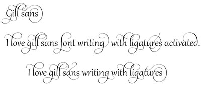
The fact that we can more easily fix these issues in Word is great; but wait, ligatures can be so much more! In addition to the functional sort we saw in the example above, there are also decorative ligatures! Compare the following:
Example of Ligatures in Microsoft Word 2010The two examples use exactly the same font (Gabriola) and words; the only difference is that example (b) had the Ligatures feature activated and a stylistic set chosen! Interested? Here is how you get it going:
Creating Ligatures in Microsoft Word
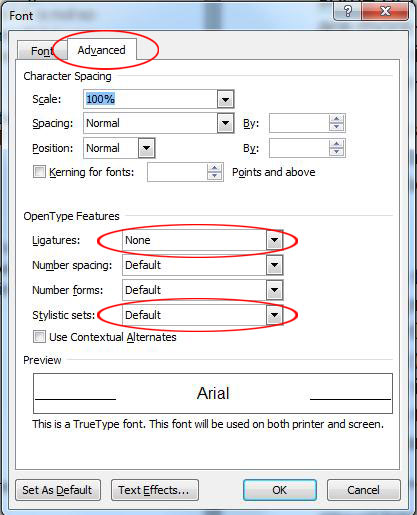
Select the text, then open the Font dialogue box on the Home tab


Go to the Advanced tab and change the Ligatures setting to ‘All’, then experiment with the various Stylistic sets.
What I find even more impressive about these decorative ligatures is that they are dynamic. In other words, they will be different depending on whether the letters are at the beginning, middle or end of the line and/or word, as well as being influenced by the letters which come before and after.

Before you get too excited, this feature in Word is still in its infancy, so not all fonts can be “ligaturised”, however in future versions we are sure to find more and more fonts with advanced ligatures and stylistic sets. For now, if it’s not too flowery, start by experimenting with Gabriola and Gill Sans and take it from there.
